 I have been using a free software application, GIMP (the GNU Image Manipulation Program), for a number of years to touch up my pictures. I shoot with an inexpensive compact digital camera, the Panasonic Lumix 12.1 megapixels. Even though it’s a nice model as far as compact digitals go, my pictures suffer from a lot of problems inherent in these types of cameras, especially when taking indoor shots using a flash (and I almost always use a flash, even outdoors, to make sure my subject is well illuminated). Almost all of the pictures that I post have been edited in some way, either color correction, cropping, fixing flaws like lens flares, enhancing faces that are in the dark, red eye reduction, etc.
GIMP has a lot of features that make it competitive with Adobe Photoshop, the industry standard when it comes to image manipulation. Probably the best feature is the ability to use layers and create layer masks. There’s another free program, Paint.NET, which also has the ability to use layers, but does not have the ability to use layer masks. There are work-arounds to that shortcoming, but GIMP handles layer masks natively. GIMP can be downloaded for free from their website. There is online documentation here.
Here are some of the ways I commonly use GIMP. Note that some of the color descriptions below may not appear the same way to you, and it may be because of differences in our computer displays. For example, I have an external monitor connected to my laptop that tends to oversaturate the colors and show the pictures with more green than the same image on my laptop display.
Color Correction
Probably the one edit I do most often is color correction and contrast enhancement. That is, most of the times, my pictures (and a lot of digital pictures in general) will come out looking tinted, usually blue, sometimes red, sometimes yellowish. Sometimes the tinting is strong, sometimes light. And often there’s not enough contrast in the picture to make the subject stand out. This is probably the easiest fix in GIMP. The tool that I use most often for these situations is the Levels Tool (Colors -> Levels). It’s really easy to use, you just select the Channel you want to work with and then adjust the three triangular sliders left and right to either lighten or darken a specific frequency range. For instance, if the picture has an overall blue tint, you can select Blue from the Channel drop down and then slide the middle triangle to the right a little bit to reduce the blue in the mid-range tones. To enhance overall contrast, I’ll pick the Value as the channel and slide the right-most triangle (the high-range tones) a little to the left, and slide the left-most triangle (the low-range tones) a little to the right.
I have also used the Curves Tool for more complex color corrections, but 95% of the time, I’ll use the Levels Tool because it’s relatively fast.
Here are before and after pictures of Casey at a temple Halloween party. The original image was slightly blue, so I decreased the blue midtones and increased the red slightly on the high end, and then increased the overall contrast (click on either picture to see a larger image).
Lightening or Darkening Areas
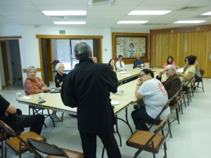
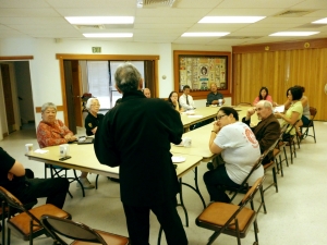
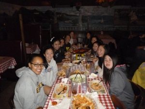
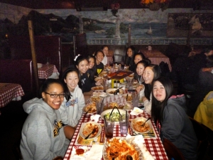
One of the most common problems I experience when taking group shots indoors with a flash is the people in the background coming out much darker than the people in the foreground:
That’s because the light from the flash dissipates so rapidly the further away your subject is. GIMP has a Dodge/Burn Tool that you can use to dodge (lighten) or burn (darken) spots on the picture, but it’s not very effective when you have a larger area that you want to affect, and the results often don’t look very smooth.
The way I do it is to use an overlay layer with a gradient mask:
- Select Layer > New Layer from the menu. Make sure Transparency is selected as the Layer Fill Type and click OK. This creates a new image layer above your original image layer. Because Transparency was selected as the fill type, the bottom layer shows through.
- Select the Gradient Tool. If you look at the Tool Options, the Gradient should be FG to BG (RGB) and the Shape should be Linear.
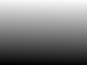
- Click and drag the mouse from the bottom of the image to the top. When you release the mouse button, a gradient image will appear that goes from dark at the bottom to light at the top:
- Display the Layers dialog (press Ctrl-L).
- The gradient layer should be the one that is highlighted. Under the Mode dropdown, select Overlay. The bottom image should now show through again.
- From the menu, select Colors > Brightness-Contrast. Adjust the Brightness and Contrast of the gradient image until the people in the image look about the same brightness.
In certain situations, you may want to select Radial as the Gradient Shape (e.g., when there’s a circular area of brightness in the middle of the picture).
When you’re done adjusting the contrast, select the bottom layer from the Layers dialog and make any color adjustments as described earlier.
There’s another technique you can try, the Contrast Mask, but I’ve never had much success getting the image to look the way I want; it always ends up looking too flat.
Removing Unwanted Material
This is the technique that became known as Photoshopping – the alteration of a photo to remove subject matter from an image, or to add subject matter to the image that wasn’t originally part of the picture. This can be useful when you want to remove material that is distracting or hides portions of the main subject.
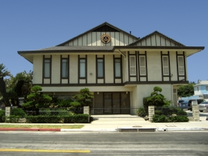
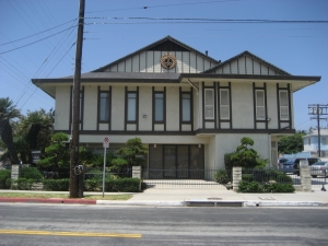
Here is a “cleaned-up” image of the front of the Venice Honwanji Buddhist Temple taken from across the street.
Even if you have visited the temple many, many times, you may have missed what was removed from the picture. This is the original image:
As you can see, I had rotated the image slightly, removed some of the blue tinting, but more importantly, I removed the parking sign, the power pole, and power lines to create a cleaner picture that was free of those distracting elements. I did this mainly by cloning other sections of the picture over the parts I wanted to remove.
Layer Masks
Probably the one feature that I make the most use of is layer masks. A layer mask allows you to isolate parts of an image by hiding (masking) parts of an upper layer so that the corresponding parts of a lower layer show through. This is best illustrated with an example.
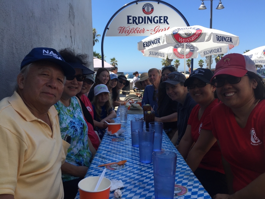
Here is a picture of several members of the VHBT enjoying a nice lunch after participating in a Heal the Bay beach clean-up:
As you can see, most of the faces are hidden in shadow. The photographer could have alleviated the problem by turning on the flash, but even so, the people in the back would still have their faces hidden.
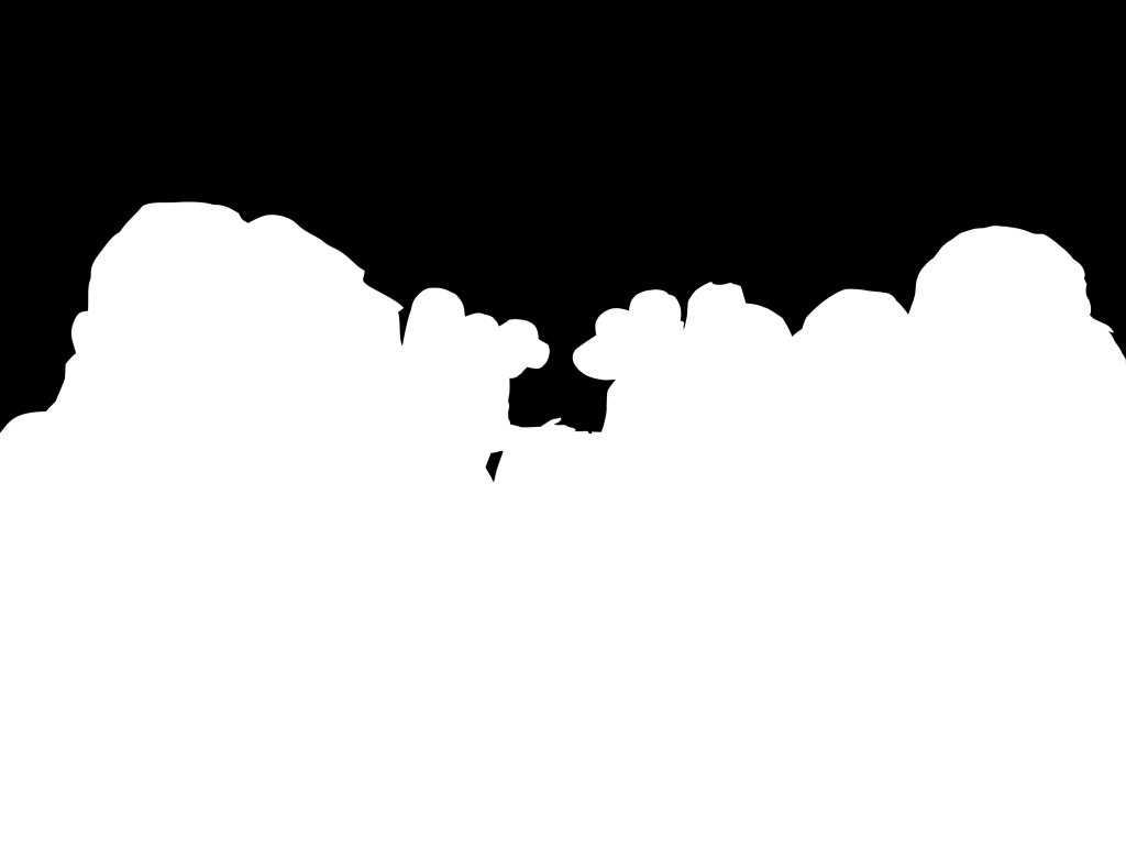
To fix this, you can try brightening the entire image, but that would wash out the details in the sunlit background. Instead, create a layer mask of the foreground:
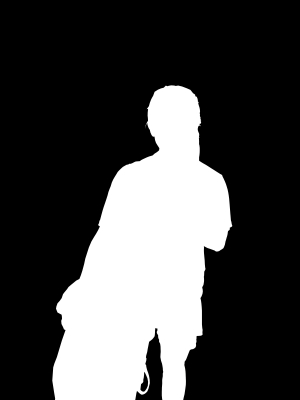
As you can see, a layer mask is basically a black and white copy of the original image, where white represents parts of the image layer that I want to show through the mask, and black masks the areas that I want to hide, but where I want the parts from the lower layers to show through. I created the layer mask by taking a copy of the original image and using a path tool to select an area around everyone in the shadow, and doing a bucket fill of the selection with white, an “invert selection,” and a bucket fill of the rest of the area with black. I use the pen tool for any fine touch-ups and to get blocks which aren’t contiguous with a particular area. I will usually also apply a Gaussian Blur to the mask, it softens the effect of the mask around the edges so the effect isn’t so severe. There are other methods for creating the mask, but I prefer this one because it gives me the best results, and if the image you are trying to isolate has a lot of smooth lines or curves, the path tool is a great way of making the selection.
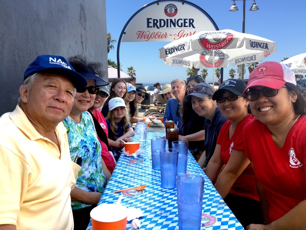
Then I go back to the original image and create a duplicate layer, so I have two, identical layers. I attach the layer mask to the top layer (you can read how to do it in the GIMP documentation; I don’t want to waste space in this post on specific details). I then click on the color thumbnail in the upper layer (so I’m editing the image and not the mask) and use the Levels tool to brighten up the top layer. I end up with a composite image that looks like this.
So what happens is that the white part of the layer mask allows the foreground image to show, but the black portion hides the rest of the layer, which would have been washed out due to the brightening of the entire layer. Instead, the background from the unaltered bottom layer shows through the black portions of the mask.
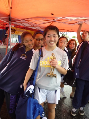
Here is a picture of Kayla, who won a trophy for being named to the All Tournament Team of a basketball tournament:
You can see that her teammates are yukking it up in the background, which can distract from the focus on Kayla’s accomplishment.
Here’s the layer mask which will isolate Kayla on the attached top layer.
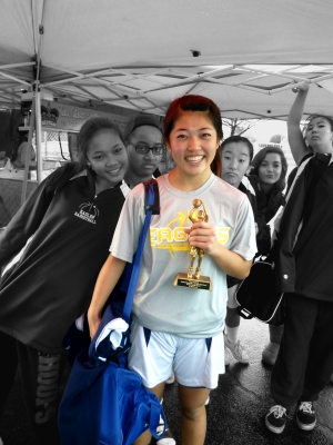
After attaching the layer mask to the top layer, I then desaturate (i.e., turn into grayscale) the bottom layer and, after doing some color corrections on the top layer, I end up with a composite image that looks like this.
The white part of the layer mask allows Kayla’s image to show, but the black portion hides the rest of the image, allowing the bottom layer (the grayscale image) to show through.
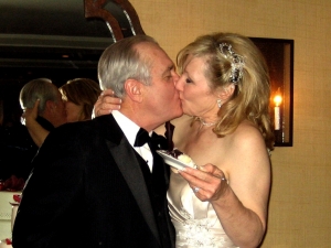
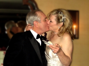
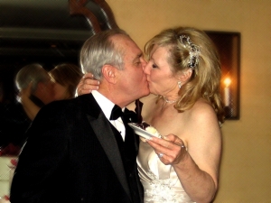
There are all sorts of effects you can do using layer masks. Here is a picture of our friends, the Burgess’, at their wedding back in early 2011.
Definitely needs some cropping so we can focus in on the couple, and seeing their reflection in the mirror adds an interesting element.
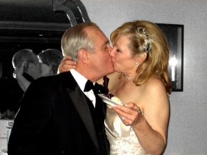
Here’s the same image, but a layer mask has been applied to the top layer of a two-layer “sandwich.” The bottom layer had a Gaussian Blur applied to it, so we get a nice depth-of-field effect, where the focus is tight on the couple.
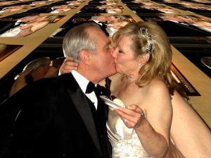
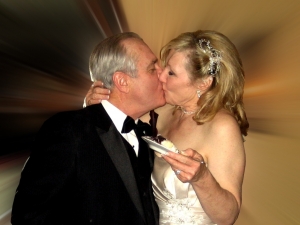
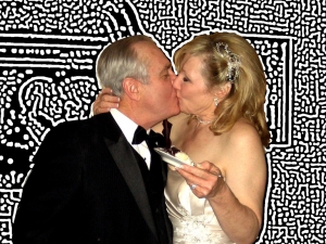
GIMP has all sorts of creative filters that can be applied to the bottom layer:
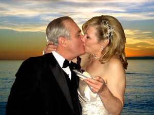
You can even change the bottom layer to a completely different image to change the locale of the picture.
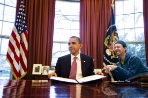
Here is a composite picture of my friend, Ethan, about to put the scare into President Obama in the Oval Office.
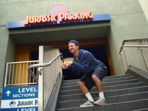
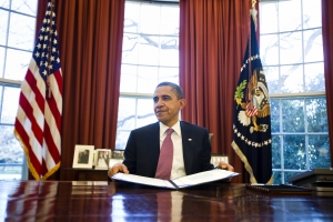
The original images were a picture of Ethan, mimicking a dinosaur at the Jurassic Park ride at Universal Studios Hollywood, and a picture of President Obama taken by UPI photographer Jim Lo Scalzo:
The composite image consists of four layers. The bottom layer is the intact picture of the oval office. The second layer is the image of Ethan’s entire body, cropped out of the Jurassic Park picture, rotated, and color-enhanced to match the lighting. The third layer is a duplicate of the oval office layer, but with a layer mask applied so that the desk appears in front of Ethan and hides the lower part of his body. The fourth, and top-most, layer creates the reflection of Ethan on the Oval Office desk (take a close look at the enlarged composite image). This reflection adds to the realism of the composite image. The layer was created by copying Ethan’s layer, flipping it vertically, and setting the opacity to about 40%, allowing most of the layer underneath to show through.
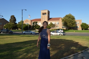
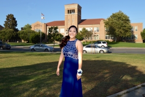
A picture of Morgan taken in front of El Segundo High School before prom. Actually, at Library Park across the street from the high school. Note that she’s in the shadows.
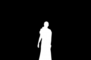
I created an image mask.
Image mask was used to lighten Morgan, I cropped the image, and then removed some distracting elements, like the fire hydrant and the street light.
To be continued …
